Main Event
Discover, Define, Design
Main Event is an entertainment + restaurant hybrid featuring bowling, laser tag, and an arcade. There are over 50 stores in the U.S. We went deep to understand their customers’ experiences, where they had opportunities, and how that translated to a digital product that amplified in-person experiences while making team member days easier.
This product can be viewed in the iOS and Android app stores, and there’s a ton of material to share in more detail about the process, deliverables, and results - just ask. :)


We delivered an MVP product to improve customer satisfaction, increase revenue per visit, and streamline multiple digital and physical touch points for guests and team members. We used a Discover, Define, and Design approach to guide stakeholders through the process of understanding customer needs and designing interfaces to meet them. Our work is in both Android and iOS app stores.
THE ASK
Although Main Event had over 50 centers across the U.S., they did not have an app to help customers plan their visits. Customers were frustrated with the multiple processes between phone, PDFs, web, and on-site required to do simple tasks like reserve bowling lanes, plan birthday parties, and make payments. Employees struggled to provide adequate service across these processes as well, and customer satisfaction was at an all-time low.
THE CHALLENGES
Leaders understood that a digital product could improve satisfaction and revenue, but they weren’t sure where to begin. Stakeholders had very different ideas about which features should be prioritized, and struggled to synthesize and leverage insights between comment cards, employee feedback, technical restraints, and analytics.
MY ROLE
As design director, I led a team of five and contributed daily to research, design, and client engagement rituals. Key activities included creating our research plan, organizing sessions, synthesizing insights, directing various deliverables including flows, journey maps, research reports, wireframes, and more.
OUR APPROACH
Our first step was to collaborate with stakeholders across the business to align on a hypothesis and mission statement for the project. This foundation provided guardrails for our inquiry, helped us understand technical and business requirements, and was referenced throughout every phase of our engagement.
OUR PROCESS
The 8 week engagement included three phases: discovery, definition, design, and deliver. During discovery, we performed research activities to better understand our users, and in definition, we collaborated with the client to translate those insights into prioritized features and flows for the MVP product. Our design phase turned wireframes into clickable prototypes used for lightweight usability testing.
WHY HYPOTHESIS?
Kicking off our project with this framework was critical for success. It provided important alignment on our research objectives but also built consensus on things we didn’t know and needed to understand, from areas of inquiry to potential value to the business.
RESEARCH THEMES
ILL COMMUNICATION
When guests are uninformed, lost, or incorrectly targeted, they feel misunderstood, frustrated, and defensive. Empower guests with the contextual, helpful content they crave that’s missing from current digital and physical experiences.
DEFINITION
We spent a day with our primary stakeholders to review our research and workshop an MVP feature set together in real-time, focused on the things that would have the biggest impact on both the business and the guest.
Our Jobs to Be Done scenarios helped us examine specific use cases, and the experience pillars, research themes, and technical requirements gave us the guardrails to make good decisions quickly. We’re not worried about how we’ll design these features yet; we’re simply identifying the things that will make the biggest impact within our feasibility scope.
Next, we developed simple product requirement documents for each epic and diagramed hero flows for each. Once complete, these PRDs became more detailed user stories for our backlog. ME’s development team collaborated with us to confirm technical feasibility every step of the way.

PRODUCT VISION
MORE PROCESS, MORE PROBLEMS
Guests inherit an invisible burden when employees spend energy manually connecting disconnected processes, systems, and silos.
TRUST ISSUES
Guests (and employees) have both emotional and functional drivers, rooted in how they want to be perceived, who they are with, and what’s on the line. A lot of trust is given, and the vulnerability should be respected.
Most of a product definition is about documentation, but we included a creative direction for the future product to help stakeholders begin to see and feel the progress. The team applied updated visual styles to our prioritized features, delivering clickable prototypes that facilitated consensus and support.
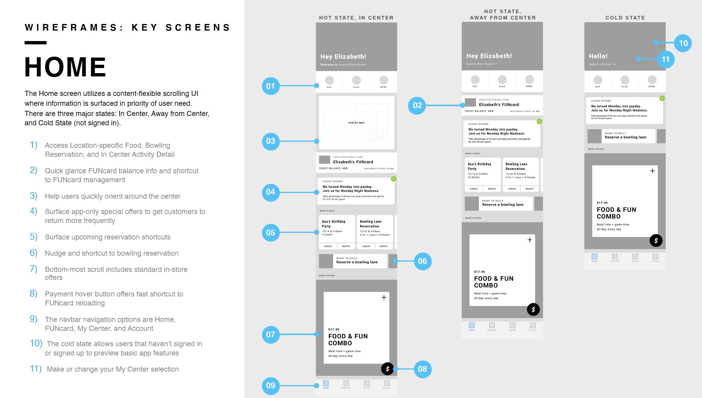
DESIGN
We used an MVP app map, PRDs, flows, and requirements documents for six two-week design sprints. At the end of the first week of each sprint, we shared annotated wireframes with Main Event’s developers to confirm our functionality. After approvals, the second sprint week was all about applying visual design, perfecting UI, and developing a scaleable design library and style guide. We used Zeplin and Figma to work in real-time with our clients, enabling us to create and document a system that Main Event still uses today for all their digital products and services.
After our design sprints, we helped developers through visual quality assurance and preparation for app store submissions while creating socialization materials for stakeholders to use with their board of directions and CEO.
This project led to several other initiatives, including the employee version of the app, a digital roadmap, in-center kiosk UI design, and a holistic customer experience strategy that led them through acquisition.